Exploring Data for Enhanced Representation
Upon my return to work from maternity leave at King's Digital Lab. I revisited the notes from the Shakespeare in the Royal Collection project. It struck me that certain key points outlined in the initial documents were not adequately represented on the staging site. One particular aspect that caught my attention was a response from the questionnaire provided to our partners, which emphasized the need to "Summarize & prioritize your goals for the site? - Illustrate/support an argument about the relationship between Shakespeare and the royals". This prompted me to consider how a visual representation using relevant data could effectively capture and convey these initial thoughts and ideas. Utilising my allocated 10% time at King's Digital Lab, I embarked on some initial exploratory work to address this gap.
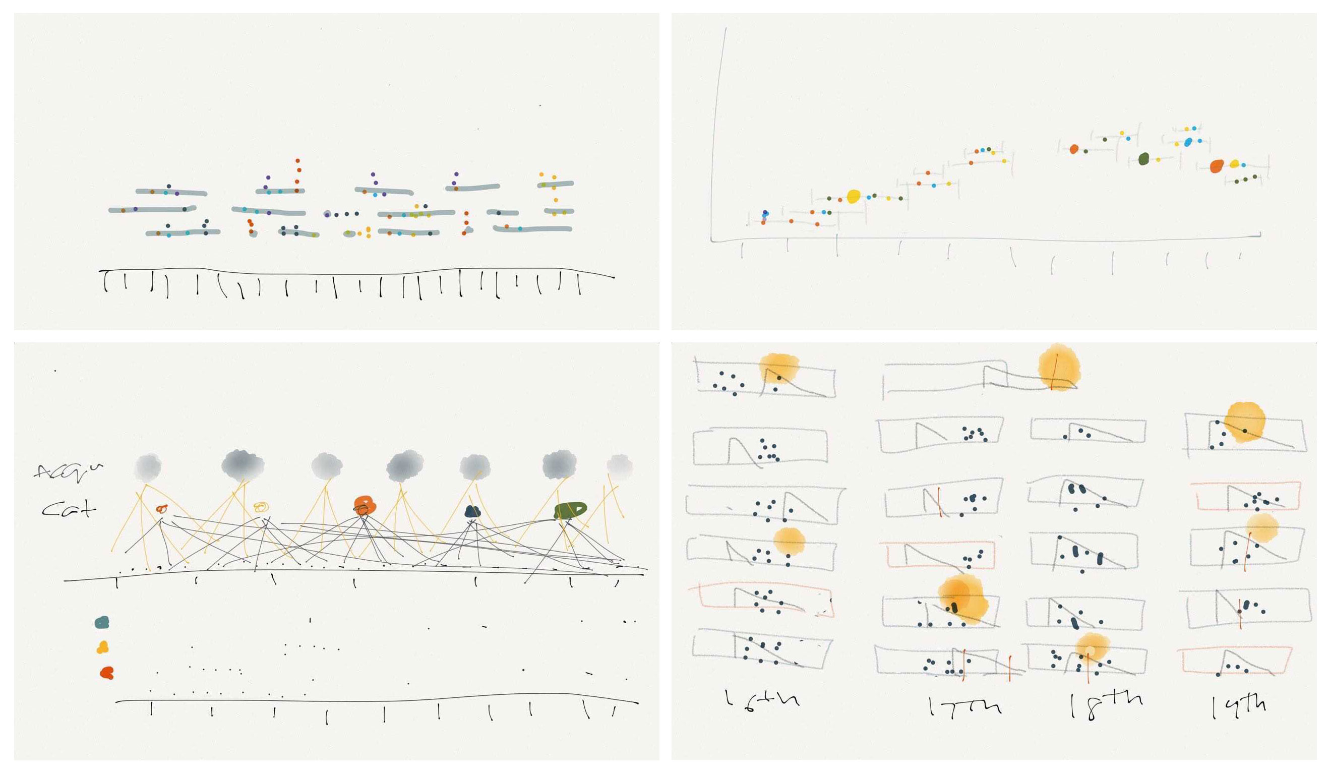
Evolving from Concept to Sketches
This project is still in its nascent stages, evolving from initial mockup concepts to the exploration of ideas in greater detail. The process involves iterating on various design concepts, experimenting with different approaches, and refining them based on feedback and feasibility. Much of this work has been carried out using Illustrator, where data points are plotted manually to visualize patterns and trends. As the project progresses, the aim is to further refine these mockups, integrating more intricate details and exploring innovative techniques to enhance the visualization of data. Each iteration brings us closer to achieving a refined and impactful design solution that effectively communicates the underlying information to the intended audience.
Version 1: Visualising Object Acquisition Over Time
The initial concept aimed to provide an insightful overview of the objects acquired by different acquirers over time through a layered timeline. The x-axis would represent the lifespans of the acquirers, while the y-axis would depict the number of objects they acquired each year. This visual representation would allow for a quick and easy identification of the top and bottom acquirers, along with when they lived. The intention was to offer a high-level perspective, while also enabling users to delve deeper into the individual objects acquired by each person for more detailed exploration.
To enhance the richness of the visualisation and cater to public interest, additional data points such as coronation dates, weddings, and information about dependents were incorporated. These types of data are typically of interest to the general public and are easily accessible, fostering greater engagement with the visualisation. By combining these diverse data sets, the goal was to uncover any potential patterns or correlations that may emerge, shedding light on the relationships between the acquirers and the objects they acquired. Ultimately, the visualisation aimed to provide a comprehensive and insightful exploration of the historical context surrounding the acquisition of objects by different individuals.
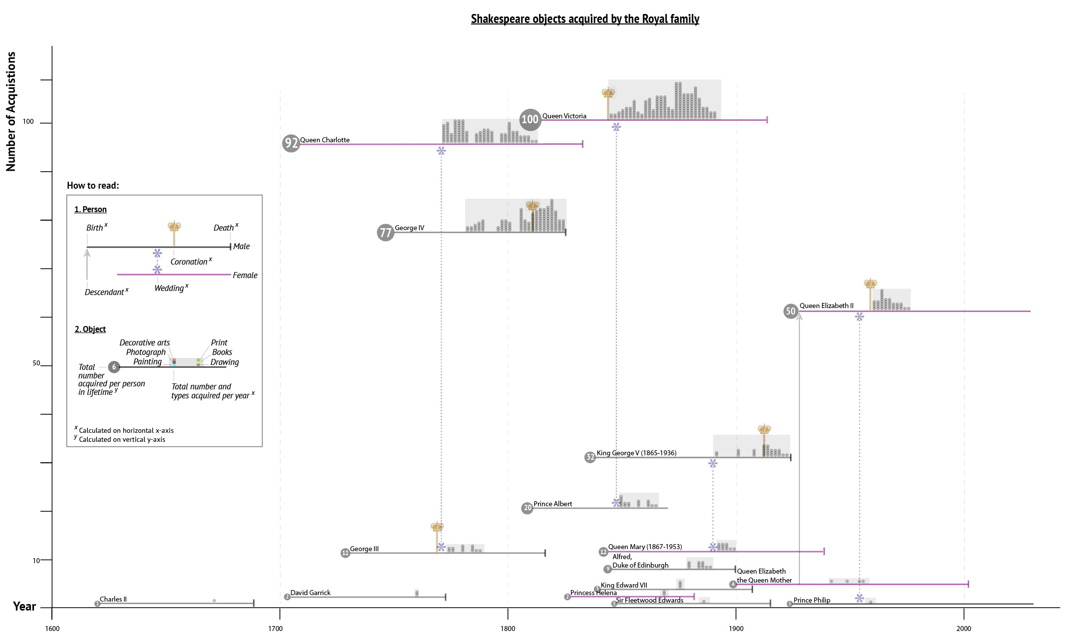
Although this layout could possibly show a lot of information, I had feedback that it was also very confusing. In particular, the combination of the smaller charts within. Overlaying would be a big issue if a several acquirers had similar number of objects and timelines.
Version 2: Simplified for more Clarity and Accessibility
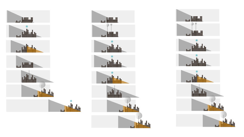
This layout underwent adaptations from its predecessor, Version 1, primarily involving the removal of the y-axis and dependents. In this revised version, the x-axis still represents time, with each rectangle symbolising a person. The width of each rectangle corresponds to the individual's lifespan, with birth years arranged chronologically from top to bottom. Notable events such as coronations are represented by orange triangles or crown icons, while weddings are denoted by blue triangles or flower icons. The objects acquired by each individual are depicted as squares, positioned along the x-axis according to the timeline of their acquisition. The height of each rectangle is indicative of the total number of objects acquired by the respective individual. This streamlined approach aims to enhance clarity and simplify the visual representation of data, making it more accessible and intuitive for users to interpret.
This would solve the overlay issue but with about 60 acquirers, the cascading step effect might look very messy and take a lot of space.
Version 3: Streamlined Layout for more Focus
The third version of the layout has been streamlined to focus on and highlight specific information in a cleaner format. At the outset of the project, I was tasked with designing the project's logo, a request made by the partners. I aimed to integrate the style of the logo into the next prototype version.
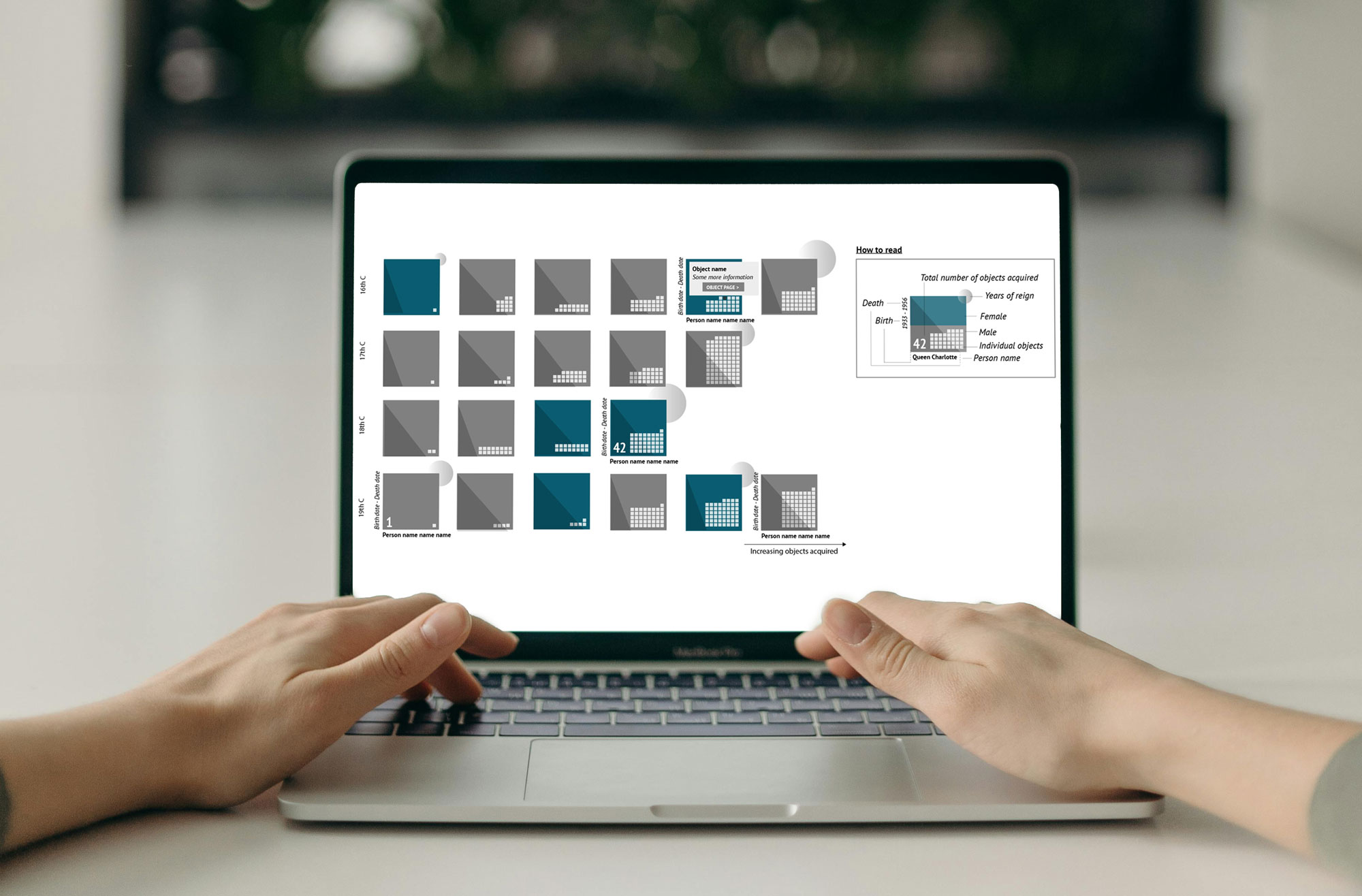
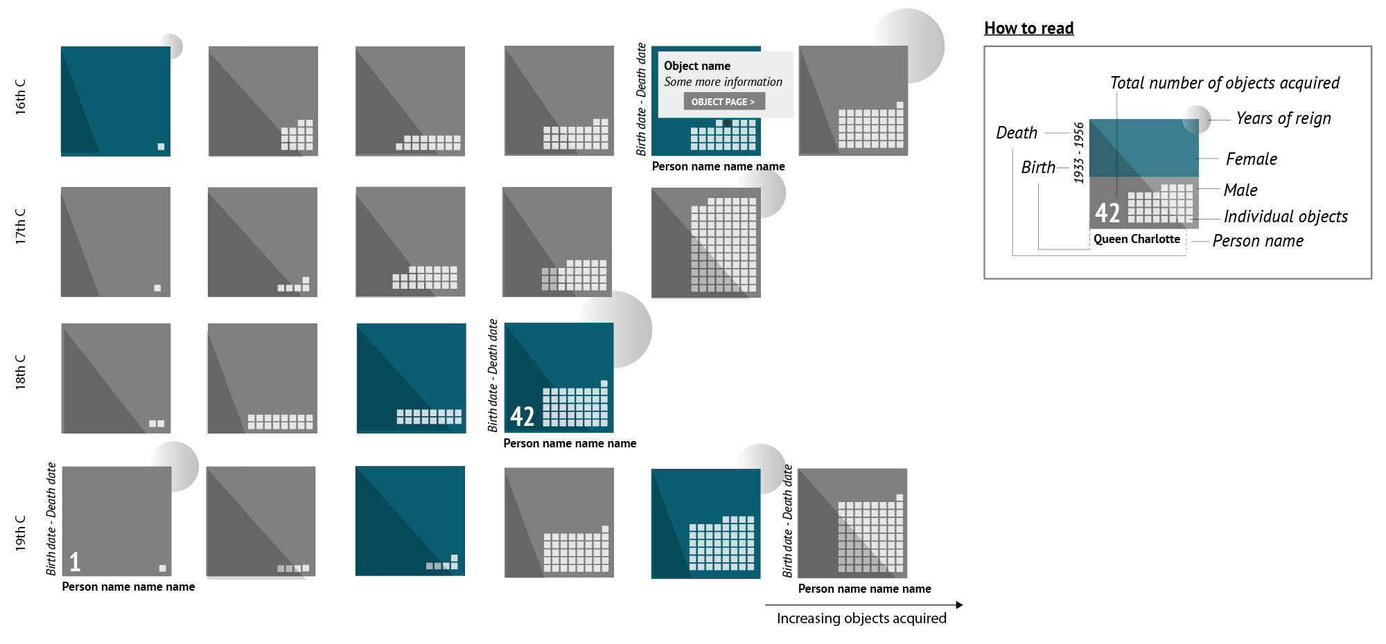
In this iteration, there are no axes. Each square represents a person and can be arranged chronologically by birth year, starting from the top left and moving right downwards. In the example provided below, individuals are grouped by century and by the number of objects acquired. This arrangement offers a clearer understanding of the number of acquirers per century, facilitating easy comparison if necessary. The triangles provide a rough overview of the person's lifespan, while the squares stacked in a corner visually represent the total number of objects acquired. Additionally, the numeric form indicates the total number of objects, although there is no visual indication of the years in which the objects were acquired. Coronation is depicted by a circle, with the size of the circle representing the number of years in reign.
This might have a very uneven layout if one century has a lot of acquirers and might not be easy to layout on smaller screens. Not sure if it’s too stripped down, missing too much interesting information that the earlier versions had. Or if some things, like the lifespan (triangle), or years of reign is not obvious/necessary.
Pausing Prototype Development for Data Acquisition
Following the conceptualization of Version 3, I initiated work on a simple prototype to bring the design to life. However, progress on the prototype was momentarily halted due to the unavailability of all the necessary data. Recognizing the importance of having comprehensive data to accurately represent the envisioned layout, I decided to temporarily pause development until the required information could be obtained. This break provided an opportunity to reassess the project's requirements and refine the approach to ensure that Version 3 would effectively meet its objectives once development resumed.
