Data-Driven Insights into the Past
The Living with Machines project represents a multidisciplinary collaboration involving the British Library, the Alan Turing Institute, and universities including Cambridge, East Anglia, Exeter, Queen Mary, and King’s College London. Its mission is to explore historical narratives by employing data science, machine learning, and public engagement activities. A core focus has been analysing 19th-century newspapers to uncover insights into societal shifts during the industrial age.
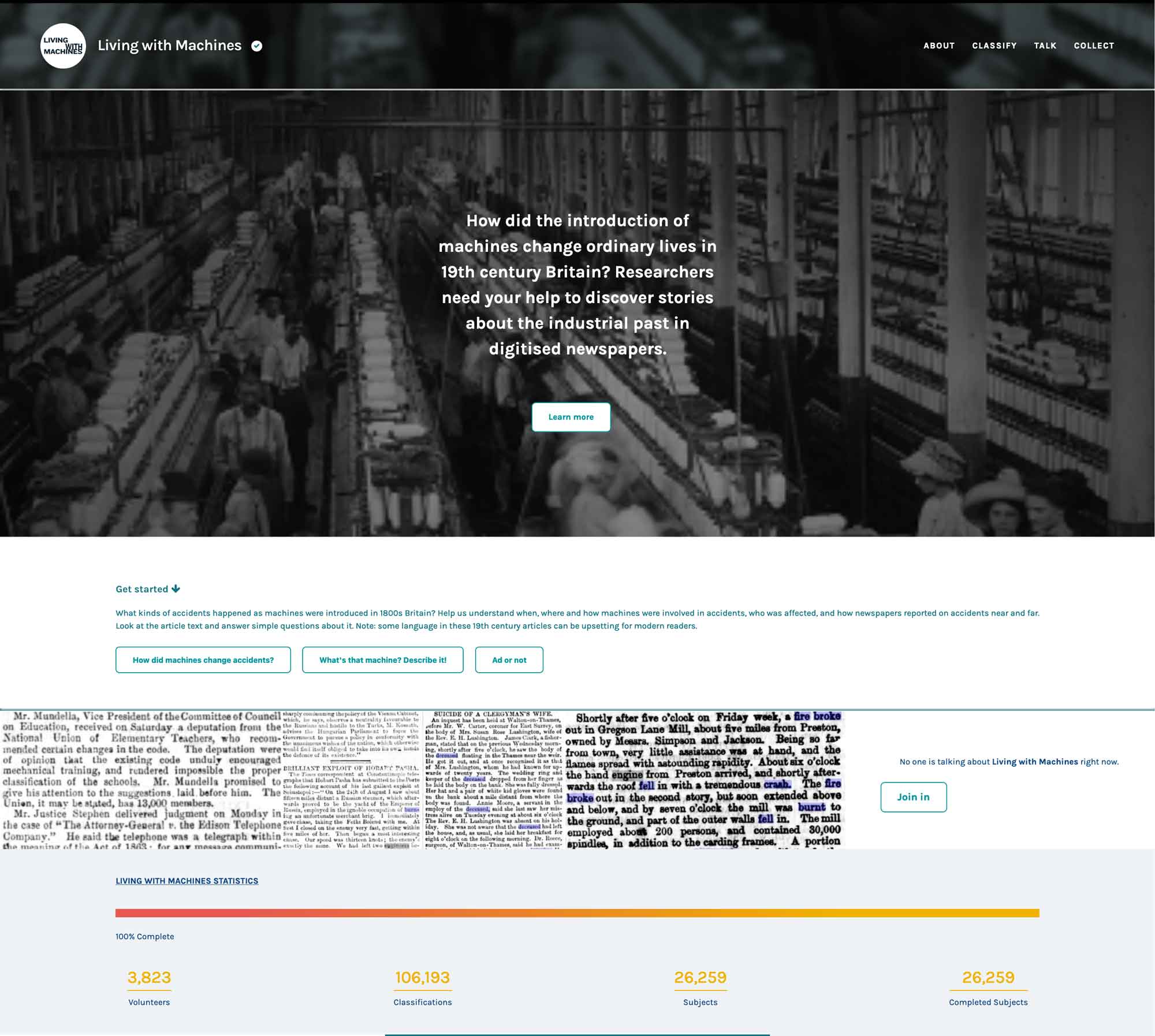
In 2022 and 2023 the team ran a series of crowdsourcing tasks on the citizen science platform Zooniverse. They asked members of the public to look at articles from 19th century newspapers that mentioned specific types of machine that they thought would yield interesting results.
Key Research Strands and Outputs for Public Engagement
The project includes two primary research strands, each with interactive notebooks designed to analyse data, visualise findings and engage diverse audiences:
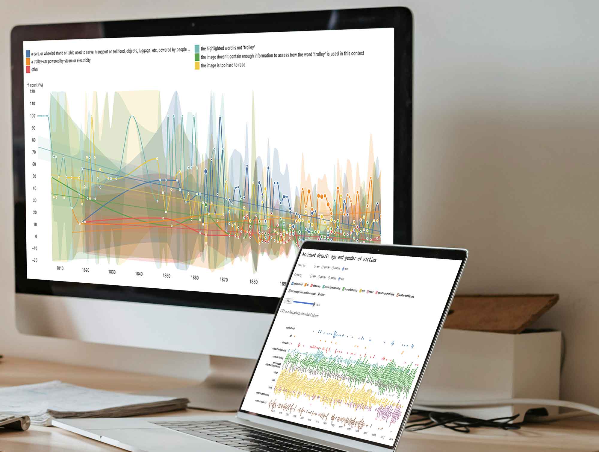
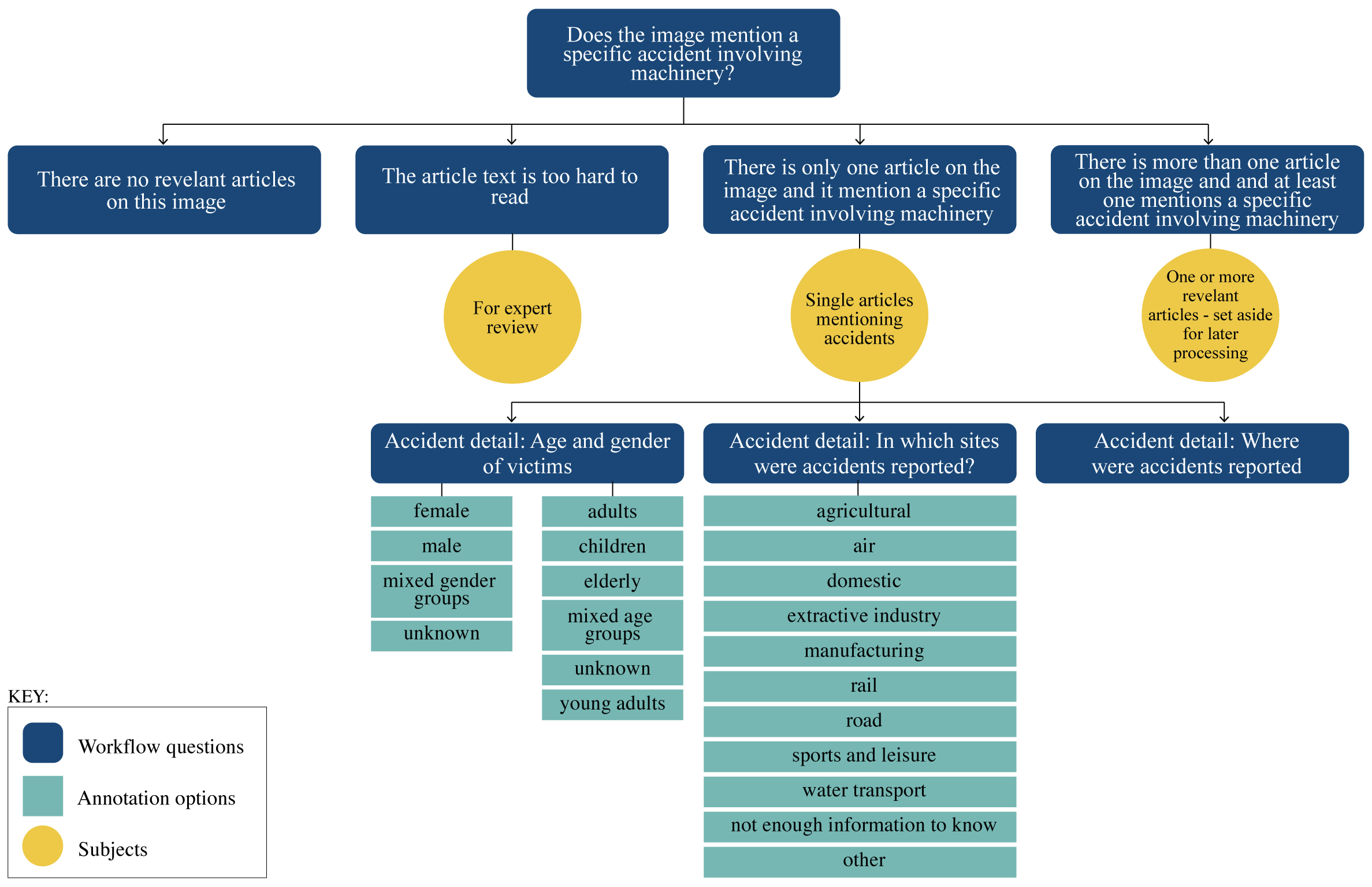
The Language of Accidents notebook explores how mechanisation influenced accident trends. It offers visualisations of accident frequencies by year, geographic distribution, and victim demographics, such as age and gender. The tool also includes background information about the data sources, allowing users to contextualise their findings.
The Language of Mechanisation notebook investigates how words related to mechanisation evolved over time. It enables users to explore changes in word meanings by year, location, and newspaper publication, offering a rich view of language dynamics in the 19th century.
A Collaborative and Adaptive Design Process
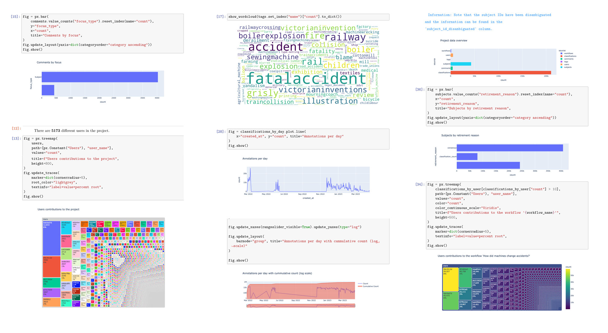
The project team conducted detailed discussions to understand datasets, such as crowdsourced annotations and metadata from historical newspapers. A range of graphs were created in jupyter notebooks to better understand the data and the direction to take.
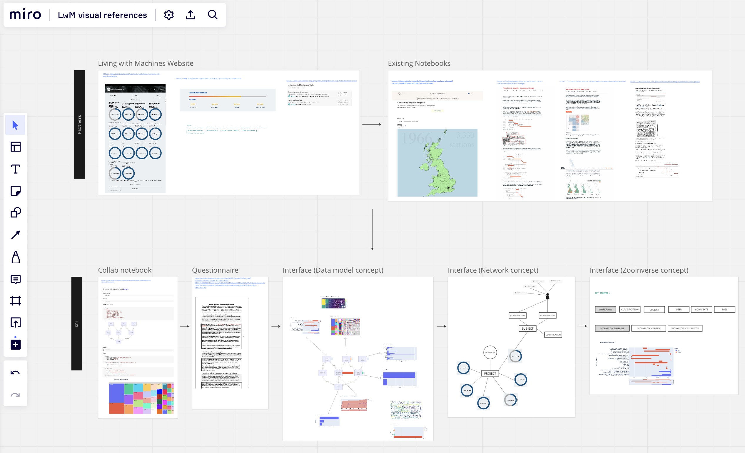
Using a Miro board, the team mapped out iterative design solutions, ensuring alignment with project goals and audience needs. Time and budget constraints guided the decision to adopt an existing notebook platform instead of more a customised technical solution. Observable was chosen for it’s ability to process and quickly render multiple complex data visualisations, allow for exploratory explanation content, and collaborative process. With the design limitations of the platform, the team focused on enhancing user experience by simplifying terminology, refining the narrative structure, chart types and interactions, to engage a broad audience. Accessibility considerations were prioritised, although some challenges, such as colour-based visual distinctions and browser-specific issues, were unable to be rectified.
User-Centred Testing and Iterative Refinements
Usability testing, each with 8–10 participants guided the sessions with open-ended questions, provided quick feedback on functionality and usability, highlighting key issues were analysed and addressed. Both notebooks allow users to drill down to the original source documents, linking individual data points with contextual references.
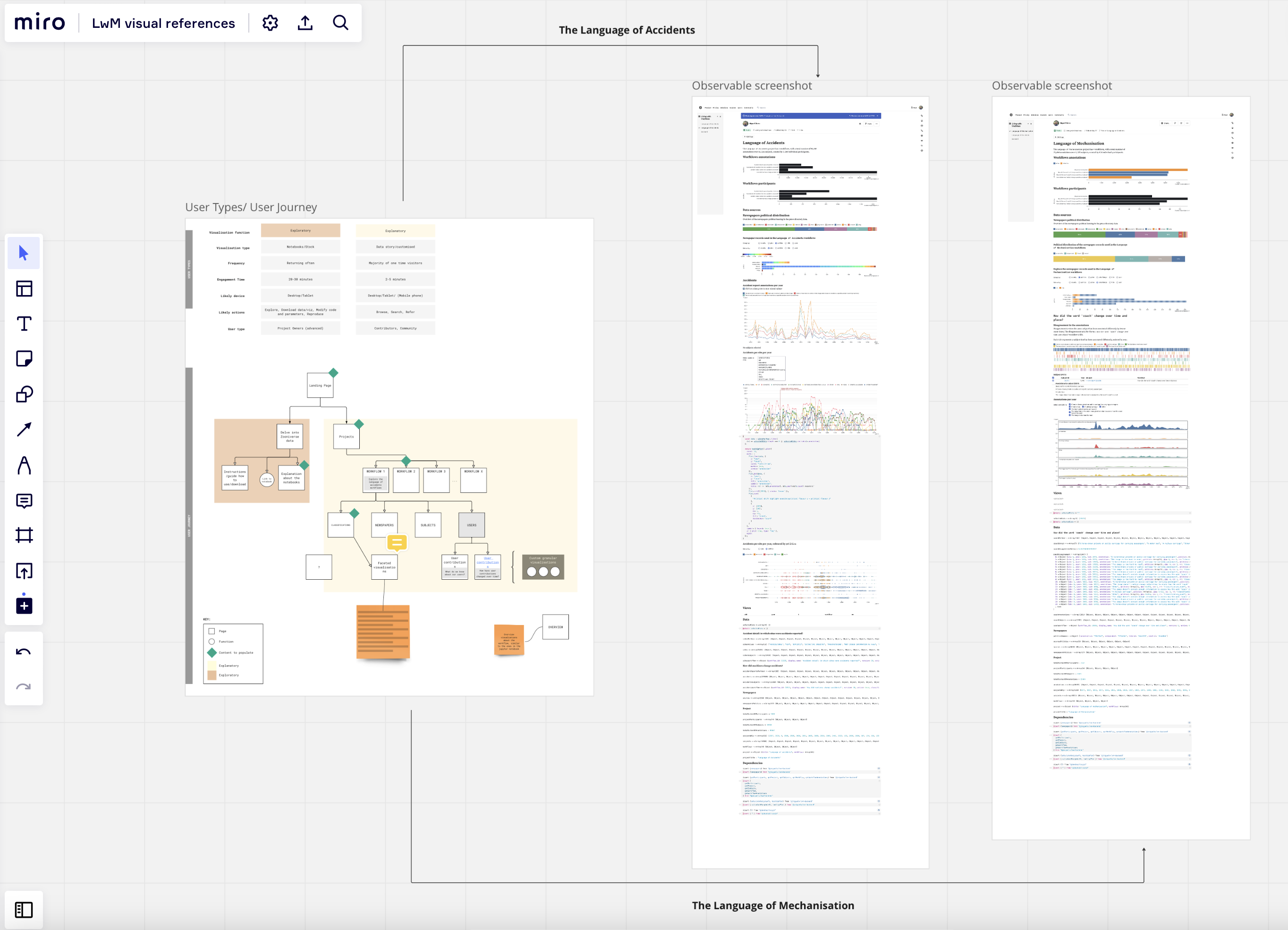
Iterative adjustments continued to be incorporated through the project, ensuring the notebooks remained intuitive and engaging. This continuous refinement reflected the project’s commitment to delivering tools that met diverse audience needs, from quick overviews to detailed data exploration.
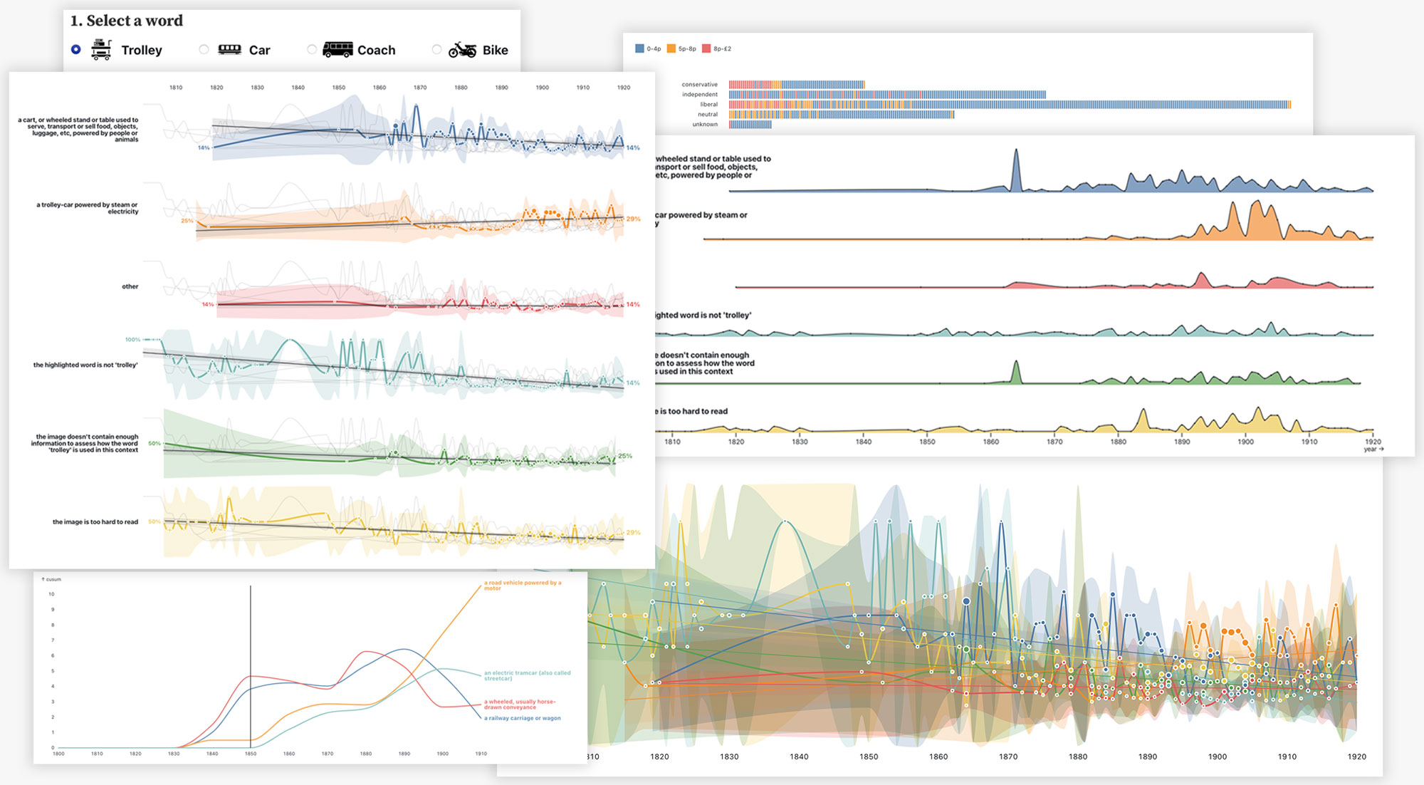
Animating Icons to Visualise Evolving Word Meanings
Near the completion of the Language of Mechanisation notebook, I felt that the addition of visual elements could meaningfully enhance the experience to accompany the focus words: trolley, car, coach, and bike, all of which are quite distinctive in form. These words had evolved significantly over time, and visuals seemed like a compelling way to illustrate those changes and make the shifting meanings more tangible.
There were some initial concerns by the team around sourcing appropriate historical visuals, especially ones that could accurately reflect the semantic shifts. I had an idea in mind but wasn’t completely sure if it would work. I looked for icons as they are universally understood to be simplified graphical representation. I turned to the Noun Project and curated a set of 10–20 icons per word that I felt were stylistically cohesive yet diverse enough to reflect the evolution of each object. Using Photoshop, I created animated GIFs with each icon appearing for 0.5 seconds, arranging the sequence to feel random but balanced.
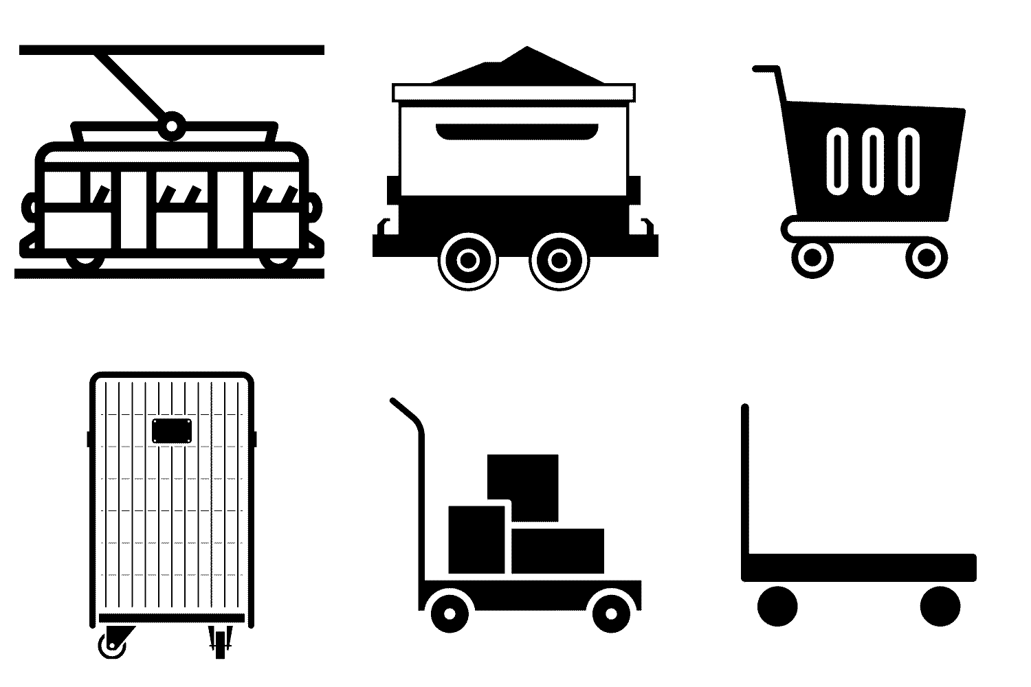


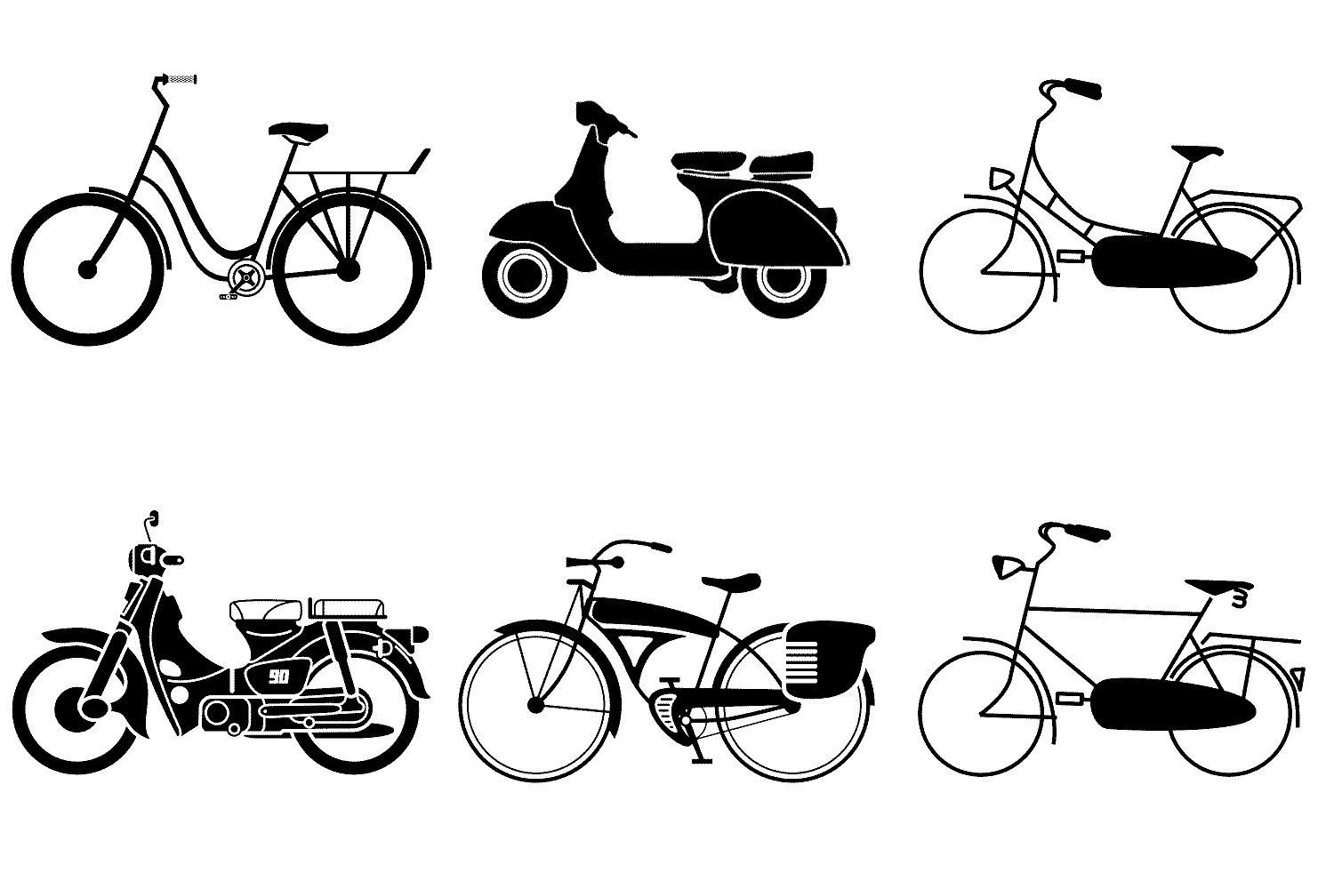
While I had originally intended to embed the images within the data charts, experimentation showed they worked better placed at the top of the screen when a focus word was selected. The final implementation allowed users to see the word accompanied by a scrolling sequence of related icons, offering a visual cue to the layered histories each word carried.
Conclusion
The Living with Machines project exemplifies how interdisciplinary collaboration and thoughtful design can reimagine historical research. By blending data science, public engagement, and technology, it has illuminated new perspectives on 19th-century societal changes. The project’s success underscores the importance of integrating research, design, and user input to create impactful, lasting contributions to our understanding of history.
