A Reunion with Livingstone Studio
Livingstone Studio holds a special place in my heart as it was where I began my career as a knitwear designer fresh out of college. The studio exudes warmth, both in its physical space and through the people who inhabit it. Over the years, I've maintained a wonderful relationship with the team, making it a delight when Inge Cordsen, the driving force behind Livingstone Studio, approached me to assist with their website redesign.
Understanding the Needs of a Clean and Simple Design
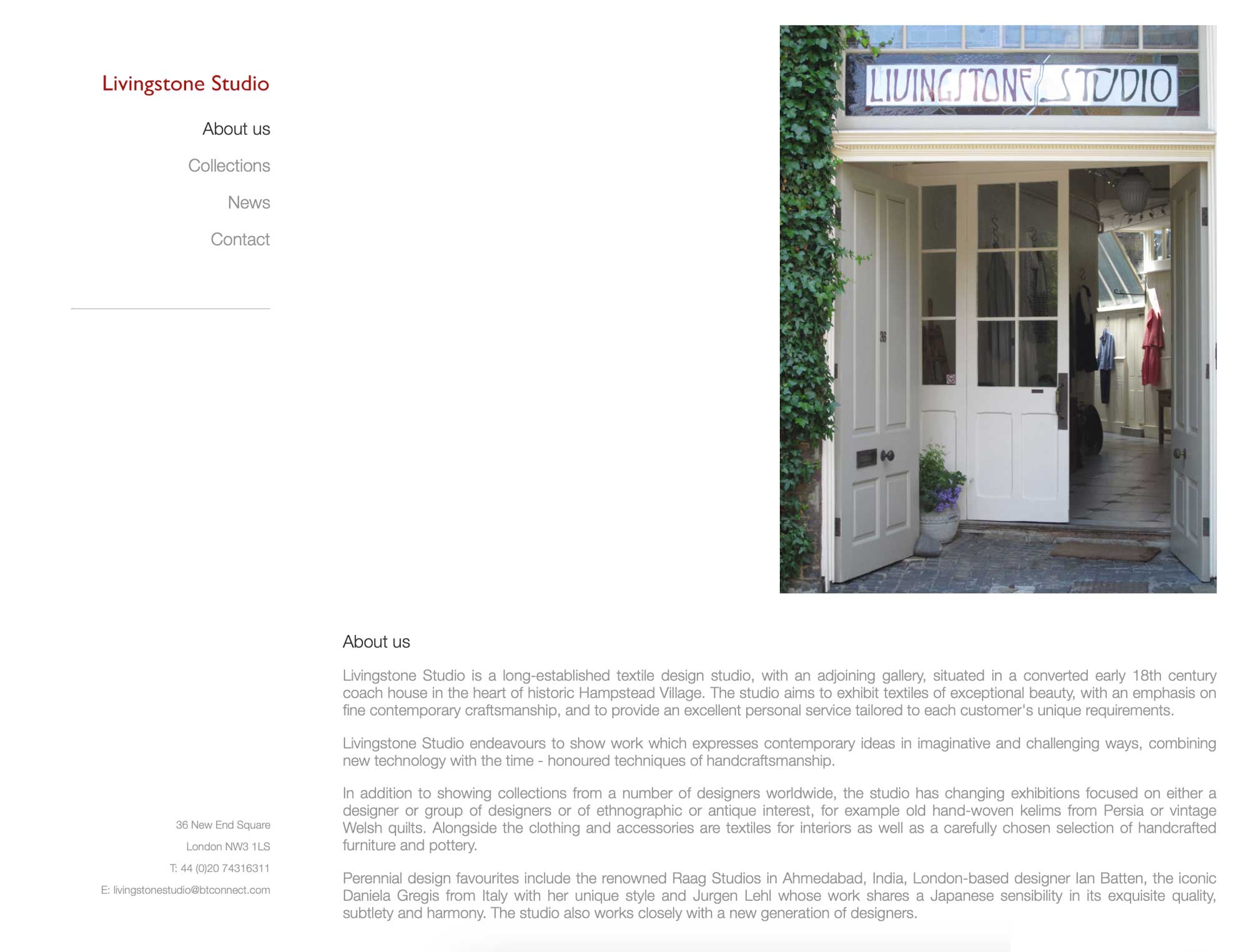
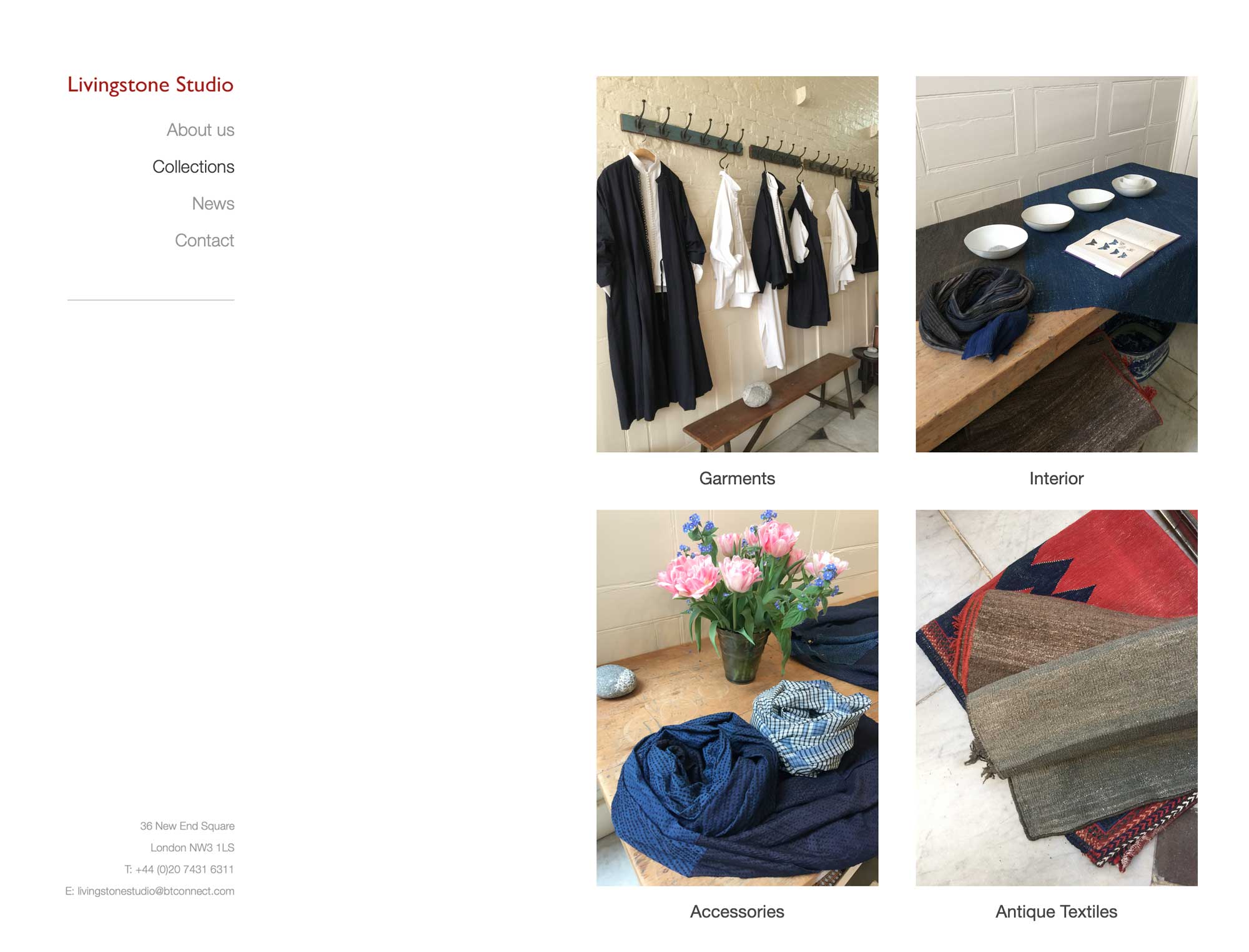
The existing website presented a single page as one image, lacking in functionality and user engagement. Inge's vision was clear – she sought a clean and minimalistic design, with just a few pages to provide a concise overview of the gallery for new visitors and essential information for existing customers. Exploring various design options, we settled on a left-side navigation layout with content displayed on the right. This approach offered an intuitive user experience, allowing visitors to easily navigate through the site and access relevant information.

Collaboration and Iteration
Collaborating closely with Inge and the team, I embarked on the design process, beginning with wireframing and prototyping to visualize the site's structure and layout. Clear communication and regular feedback sessions ensured that the design aligned with Livingstone Studio's branding and objectives. As we iterated on the design, we prioritized simplicity and functionality, refining the layout and incorporating visual elements that complemented the studio's aesthetic.

Adapting to Changing Needs
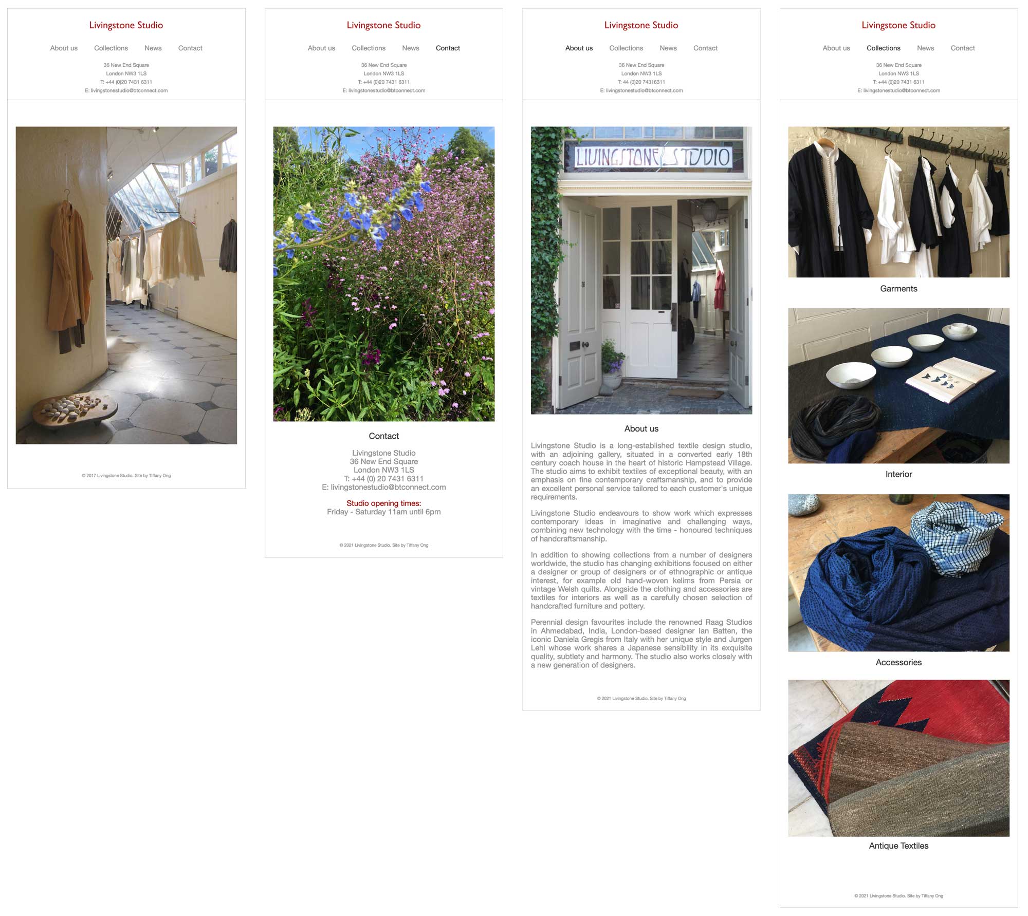
A few years later, armed with additional knowledge and skills, I revisited the website to make it responsive. Recognizing the importance of catering to users' diverse devices and screen sizes, I implemented responsive design principles to ensure optimal viewing experiences across desktops, tablets, and mobile devices. This enhancement further enhanced the accessibility and usability of the website, allowing visitors to engage with Livingstone Studio's content seamlessly.

Conclusion
The journey with Livingstone Studio has been one of collaboration, creativity, and growth. By prioritizing simplicity, functionality, and responsiveness in the design process, we've created a website that not only reflects the essence of Livingstone Studio but also provides visitors with an engaging and intuitive online experience.
