Inspiration from the Little Pictures Project
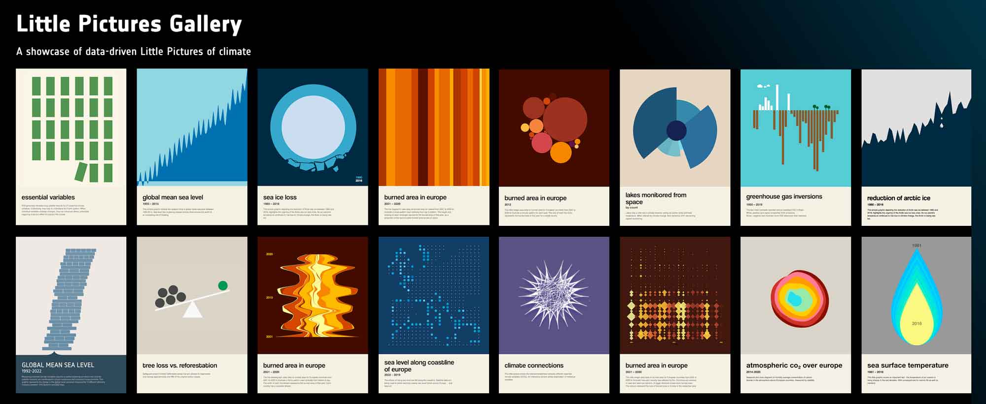
I have been wanting to work with climate data for a while but never felt confident, until now. After a busy period, I was ready to start working on a data visualisation using my personal and 10% time at my organisation, King's Digital Lab. While searching for a climate-related dataset, I discovered the Little Pictures project from the ESA Climate Office. I was immediately drawn to the simplicity of their visuals. The open-source nature of the project and the straightforward data made it an ideal starting point. Their visuals also became a direct inspiration for this project, creating simple diagrams of a complex topic.

Initial Plan and Prototype
Initially, I planned to replicate 4–6 examples directly from Little Pictures, making slight style tweaks, integrating interaction with a pause and play button to scroll through years of data. I developed a prototype that I was quite happy with, but decided to change directions.
See the Pen seaiceloss - v14 start pause button by Tiffany Ong (@ongtiffany) on CodePen.
Sea Ice loss scroll through data animation prototype
Shifting Focus to Accessibility and Sustainability
I knew from reading articles like Sarah Fossheim’s how difficult it is to make a data visualisation accessible for screen reader users. At the time, whilst researching, most visualisation tools and platforms involved adding aria labels data points, alt text to images, having the replicate the dataset in another ways to accommodate different users, and seemed like a good opportunity to explore other options combining it with the methods I have been building on with my past projects.
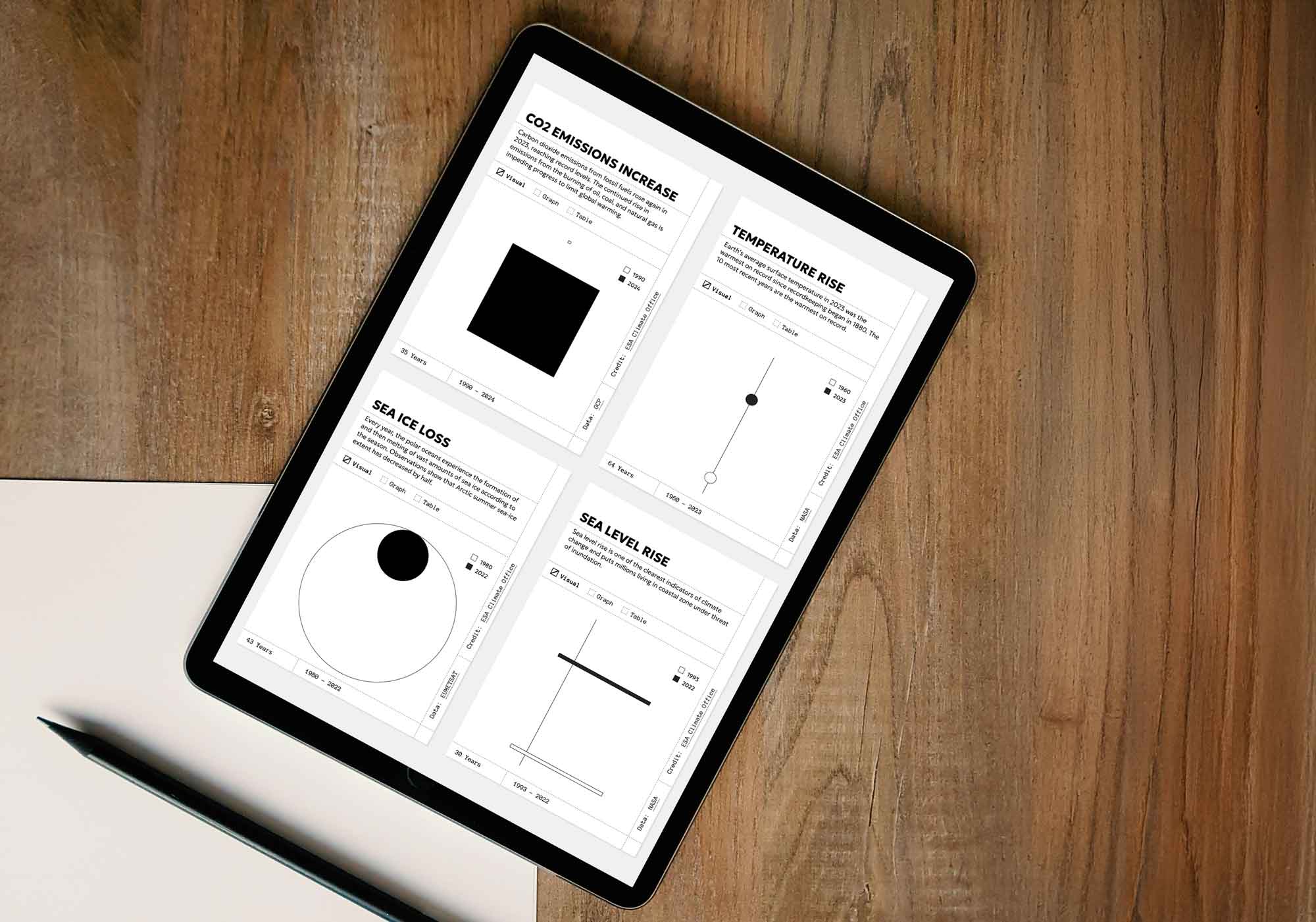
The new concept involved making a more accessible and sustainable visualisation, still using climate data and visual inspiration from Little Pictures - hence keeping the project name. It uses one HTML table output per dataset, styled in three different ways, allowing users a variety of ways to view the data, and screen reader users will be able to read the table output. Sustainability was ensured by dynamically sourcing data from JSON, using JavaScript for output, and relying only on CSS for styling. This approach eliminated dependencies and reduced code complexity.
Designing with Intentional Constraints
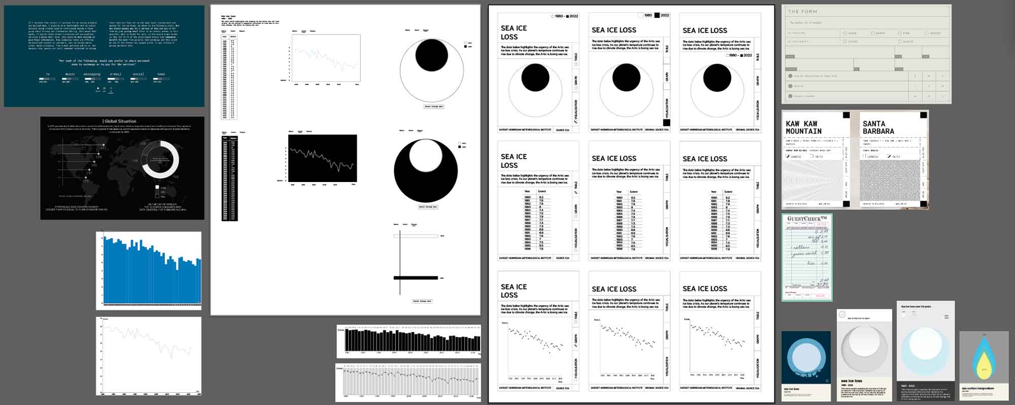
To maintain focus on the project’s core concepts, I deliberately limited the design. I avoided gradients, used a black-and-white palette, and incorporated only simple elements. This helped keep my efforts directed toward functionality rather than visual experimentation. For the card layout, I had a few sources of inspiration and mocked up several versions in Illustrator before moving on to coding the prototype.

Development Steps
These were the process steps I took, although not always linear and required multiple iterations to refine:
- JSON to HTML conversion
- Adding and styling tabs
- Styling the visual tab
- Styling the bar chart
- Styling the line chart
- Card layout
- Styling cards
Styling the bar chart was straightforward, involving adjustments to element heights based on data values. However, styling the line chart was trickier. Using a clip-path method to draw dynamic lines based on data values, I encountered alignment issues. Although I explored an alternative method with better output, its lack of responsiveness forced me to postpone further refinement.

Layout Challenges and Solutions
For the card layout, I initially tried to use Flexbox but switched to CSS Grid after encountering challenges. Using this CSS Grid generator helped me understand and implement the layout effectively.
Browser testing revealed alignment issues, particularly on Firefox and Chrome, which were not present in Safari. After two days of troubleshooting, I resolved the issue by adding position:relative; to the tbody. Additional media queries were necessary to address scaling inconsistencies.
Data Integration and Visual Styling
Integrating the data turned out to be more complex than expected. Some datasets needed simplification, and I had to source alternatives when the originals were too detailed. The javascript had to be amended repeatedly to allow it to dynamically adapt to new features and data. Previously, I would have to bother a developer (usually my partner), but this time, I had ChatGPT and even though it wasn’t always smooth sailing, it was a huge help and also helped me learn as it explained and commented the code very clearly. When it came to styling the first and default 'Visual' view, I focused on using simple graphic elements such as lines, rectangles, and circles, using size and position to depict the data values.
Feedback and Enhancements
I had planned to get feedback from my whole team but I was so delayed I only managed to show a couple and already I could tell that it wasn’t that well received compared to my pevious projects. I had expected it as there was no colour and minimal styling but still it didn’t feel great. I decided add the animation that scrolled though the data that I initially abandoned, but this time to have it on hover, in hope it would give more interest, and more importantly to highlight the data which had a strong message which I was drawn into originally not only by the subject but also by the visuals.
See the Pen Little Pictures - animation on hover, additional media queries by Tiffany Ong (@ongtiffany) on CodePen.
Prototype - animation on hover
I made a version with animation on hover but after some feedback from more testing, decided to add a button as some people found it confusing when the animations were triggered. And also changed the styling with some slight gradients and shadows to the visual styles.
Conclusion
The Little Pictures-inspired project became a meaningful exploration of accessible and sustainable data visualisation. Although challenges remained, the project laid the groundwork for future improvements and reinforced the importance of balancing functionality, inclusivity, and visual appeal.
