Objective
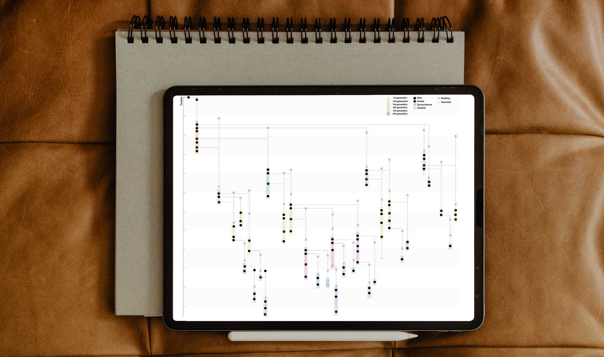
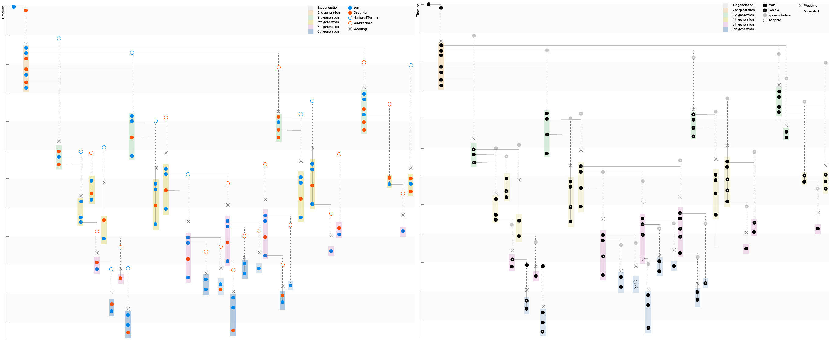
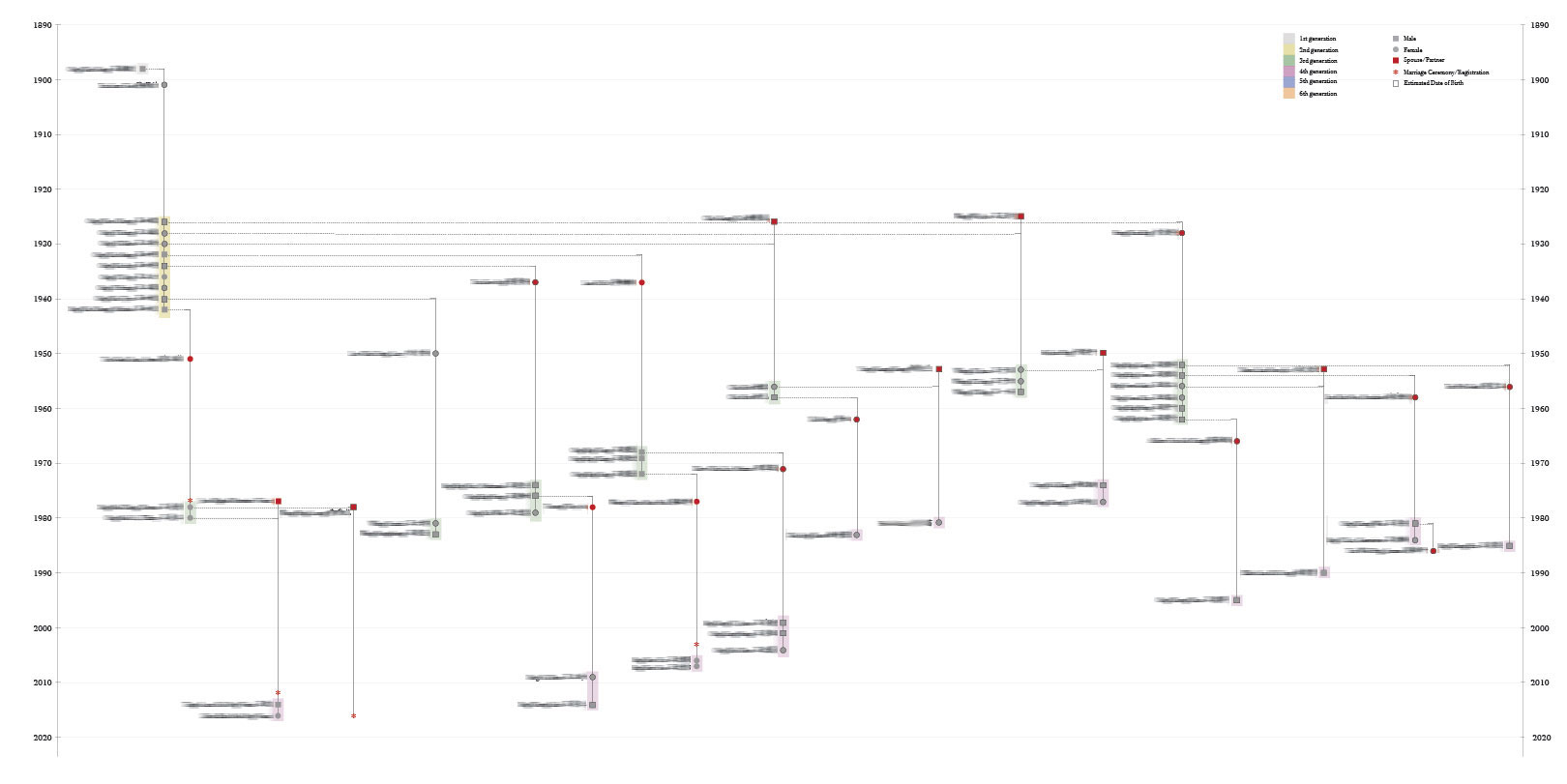
This personal project sought to create an experimental family tree that incorporates both generational relationships and timelines, categorising and visualising elements to uncover patterns and stories within family data. For privacy reasons, the chart displays only selective information, maintaining the confidentiality of specific personal details.
Process Overview
The project began with a simple Excel spreadsheet, containing foundational data such as names, dates of birth, spouses, and dependents. This information, gathered over several years from a family member, was incomplete as some relatives opted not to include specific details such as divorces, deaths, or marriages. Despite these limitations, the goal was to represent four generations in a unified visual chart, revealing insights into family dynamics, such as the tendency of males in the family to marry young while females often married later or not at all.
Design Execution
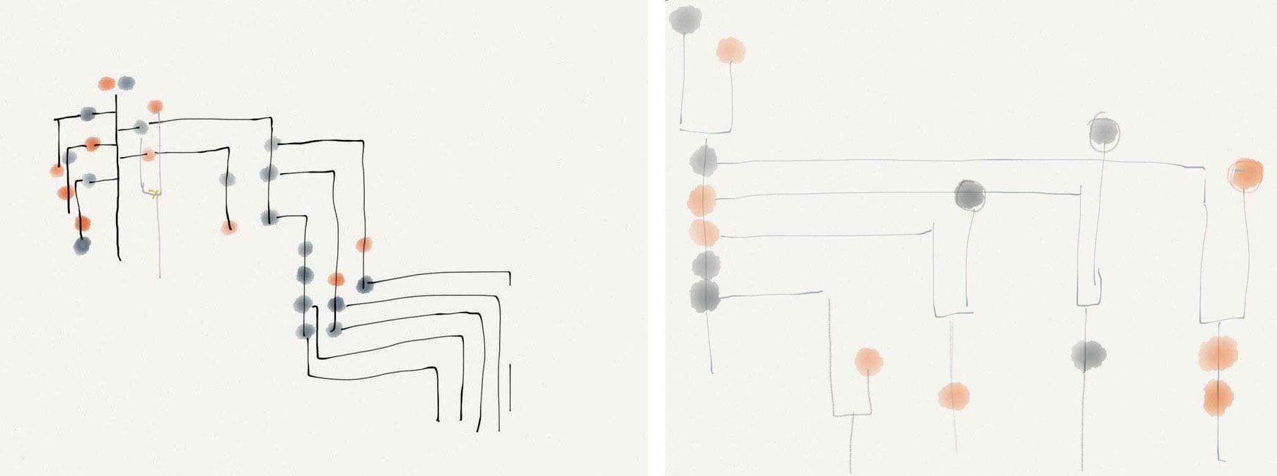
After sketching concepts on the Paper App, using Adobe Illustrator, each family member was manually positioned on the y-axis according to their birth date, with a circle representing each person. The x-axis was left intentionally without a specific metric, focusing instead on visual relationships and connections. The resulting layout not only highlights generational timelines but also provides a spatial narrative for family milestones and trends.
Future Development
To enhance functionality and accessibility, the next step is to code the design, enabling an interactive format that allows for easier updates and more dynamic data manipulation. This will support continuous data input, allowing the family tree to evolve as new information becomes available. The ultimate aim is a living digital representation that both honors family history and provides an engaging way to explore it.