Enhancing the Mirror Newspaper App
At Trinity Mirror, now known as Reach, the Mirror newspaper app for tablets, known as eEditions, underwent a redesign to improve its interface design and user experience.
Collaborative Planning and Execution
Collaborating closely with a product manager, the project commenced with a thorough analysis of the app's existing interface and user feedback. Understanding the requirements and objectives guided the design process towards creating a more intuitive and visually appealing user experience.
Designing Navigation Icons and App Elements
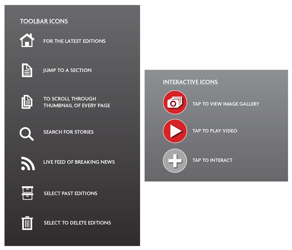
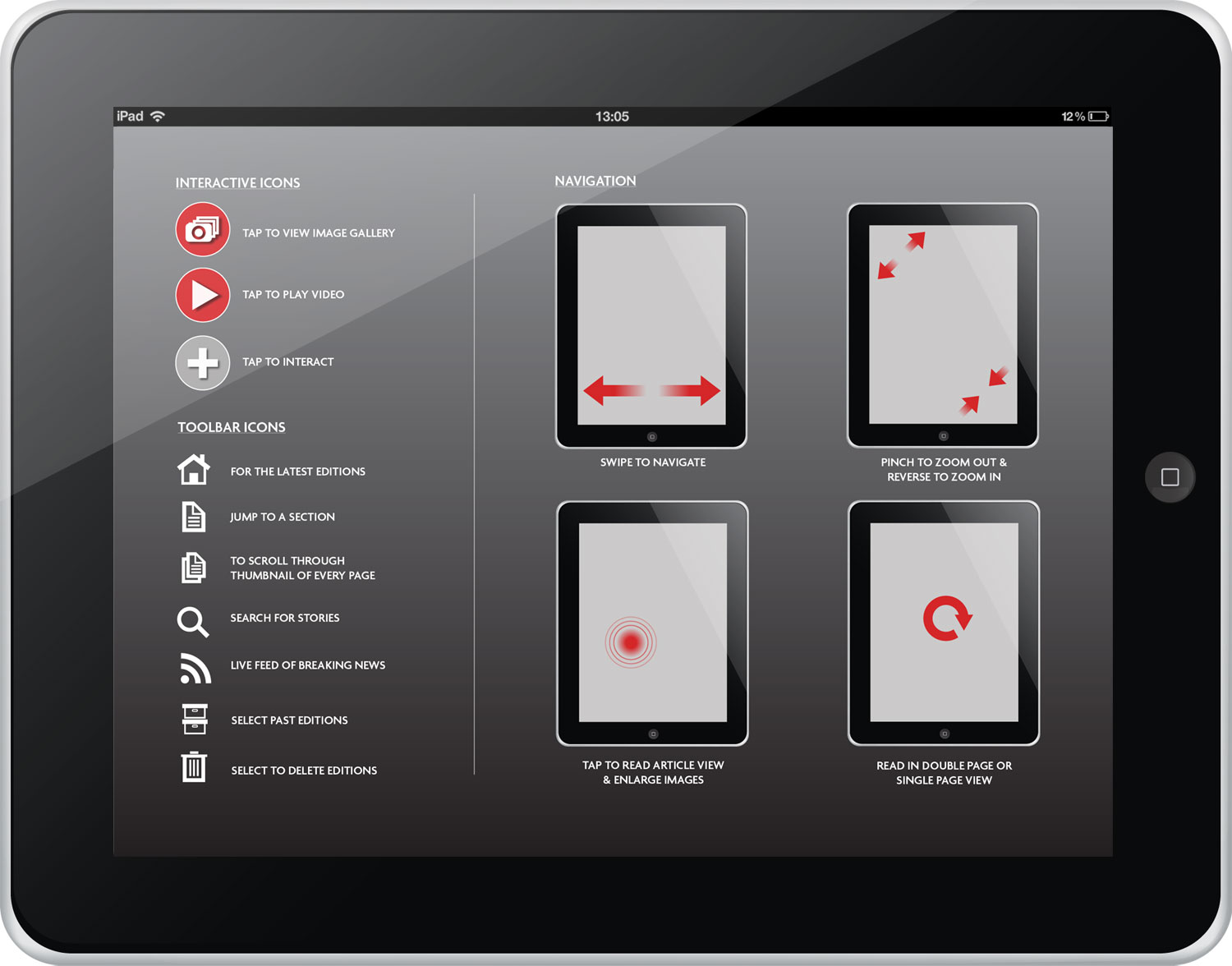
The initial phase involved designing navigation icons to streamline user interactions and enhance navigation within the app. This included conceptualizing and creating icons that resonated with the Mirror's brand identity while ensuring clarity and simplicity for users.
Crafting Help Screens and Subscription Pages
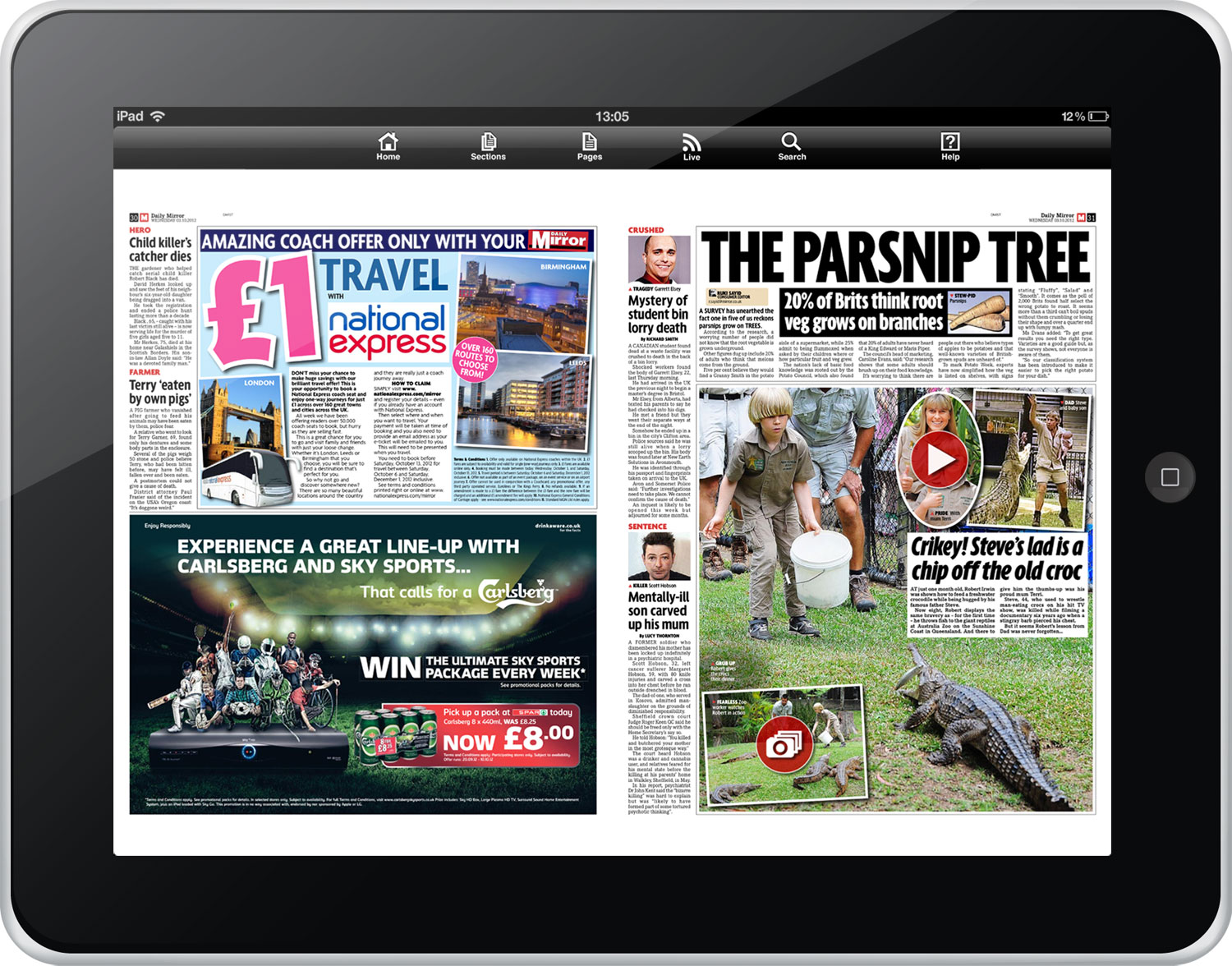
Subsequent stages focused on refining the user journey through the creation of help screens and subscription pages. These elements aimed to provide users with clear instructions and information about app features and subscription options, fostering a seamless onboarding process and encouraging user engagement.
Iterative Testing and Development
As the design elements took shape, they were implemented in Illustrator and passed on to the development team for integration into the app. Throughout the development phase, rigorous testing and iteration were conducted to ensure that the design elements functioned as intended and aligned with the project objectives.
Live Release and Post-Launch Evaluation
Following the successful implementation of the redesigned elements, the updated Mirror newspaper app for tablets was released to users. Post-launch evaluation and feedback mechanisms were established to gather user insights and refine the app further based on user interactions and preferences.
Driving User Engagement and Experience
The redesign of the Mirror newspaper app for tablets exemplifies a collaborative effort aimed at enhancing user engagement and experience. By incorporating user feedback, iterative design processes, and rigorous testing, the project succeeded in delivering an interface that resonated with users and effectively met their needs.