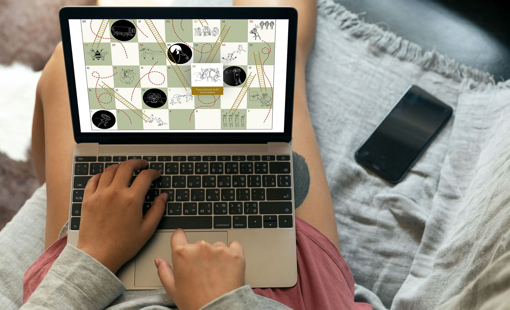
Best Practices in Achieving Athena SWAN Bronze Status
The journey towards achieving an Athena SWAN Bronze status for the History department involved numerous discussions with academic colleagues from across the UK who had encountered similar challenges in implementing standards and recommendations within an Arts and Humanities (A&H) context. Drawing from these conversations, it became evident that there was a need to aggregate best practices and share effective methods within the community.
This infographic was put together by Prof Abigail Woods and Dr Alana Harris for the project 'The Impact of Athena SWAN on Humanities Departments,' funded by Advance HE. Dr Dorothee Boulanger provided invaluable research assistance, while Tiffany Ong from King's Digital Lab handled the design, and Ben Peppiatt, a freelance designer, contributed the creative illustrations.
Crafting Engaging Research Insights despite Budget Constraints
This project, undertaken at King's Digital Lab, was characterised by its brevity and limited budget, with myself being the sole contributor alongside the project partners. Recognising the need to enhance the visual appeal and engagement of the output, the partners enlisted the expertise of an illustrator to craft captivating animal drawings. The project extended beyond static visuals, incorporating dynamic elements. These additions were intended to complement the comprehensive report, derived from a series of interviews and focus groups, by presenting the findings in a more accessible and lighthearted manner. By juxtaposing the formal report with these creative elements, the project aimed to convey complex information in an engaging and easy-to-understand format, catering to a broader audience.
Collaborative Brainstorming Inspired by Vintage Board Games
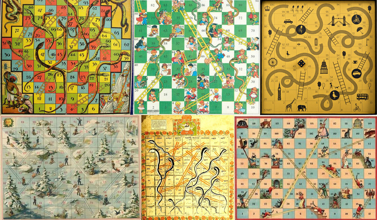
During our brainstorming session, the idea of incorporating a game for engagement emerged. I proposed the classic game of snakes and ladders, a timeless favourite known for its simple yet effective mechanics of advancement and setback, represented respectively by climbing ladders and sliding down snakes. The team resonated with this suggestion, recognizing its potential to metaphorically mirror the journey of progress and setbacks within the context of our project. Drawing inspiration from vintage game boards renowned for their captivating layouts, imaginative concepts, and vibrant colours, I delved into a plethora of nostalgic designs to inform our creative process.
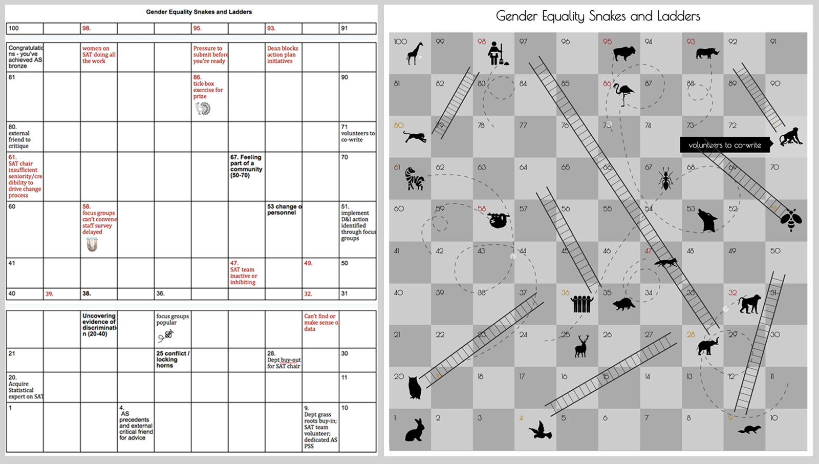
Subsequently, we reconvened for another meeting, this time harnessing the collaborative power of a Google document to streamline our ideas and visually map out the game's components. Together, we meticulously arranged and adjusted elements, ensuring a harmonious visual flow and logical sequence, all aimed at enhancing the overall user experience.
Customisation with Bespoke Illustrations and Interactivity
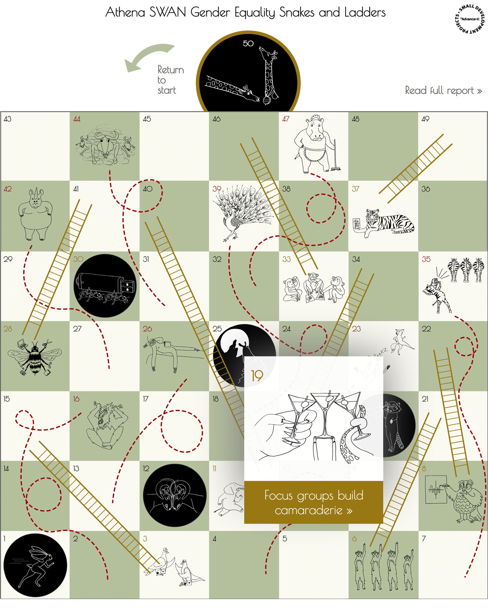
After I mocked up a prototype , the partners expressed interest in adding a personal touch by incorporating customized animals and scenarios to emphasize key points. Collaborating closely with the illustrator, they contributed ideas and feedback, resulting in a collection of unique customised drawings that elevated the project.
Inspired by the charm of vintage board game covers, I set out to recreate that nostalgic aesthetic while infusing it with a modern twist. Drawing upon timeless design elements, I crafted designs that paid homage to the classics while adding a contemporary flair.
To enhance user engagement and provide additional context, I implemented a simple modal popup feature, seamlessly integrating extra content into the user experience. This interactive element allowed users to delve deeper into the game's intricacies while maintaining a fluid and intuitive interface.
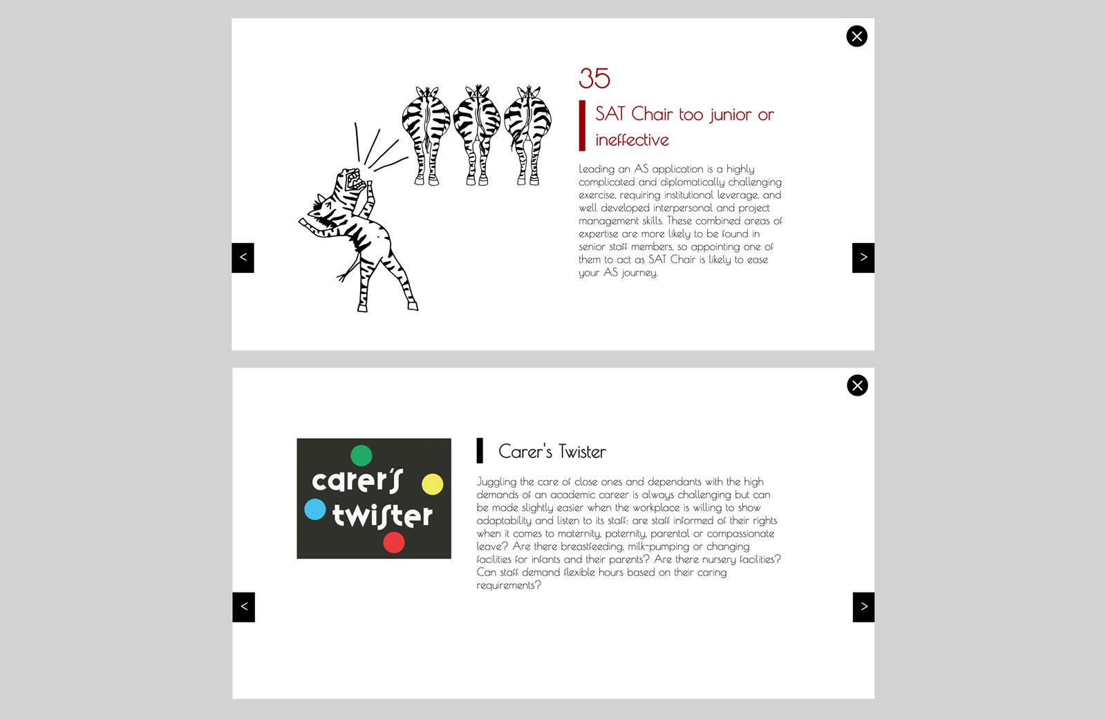
Partners' Innovations Elevate the Concept
Furthermore, during our collaborative sessions, the partners explored various avenues to enhance the concept. They sought to inject a dose of wit and creativity leading to inspired modifications to the titles of other vintage games, each tweak carefully crafted to add an element of playful charm to the overall experience and include important information. Their ingenuity and imaginative thinking ensured that every aspect of the infographic was imbued with a sense of freshness and excitement.
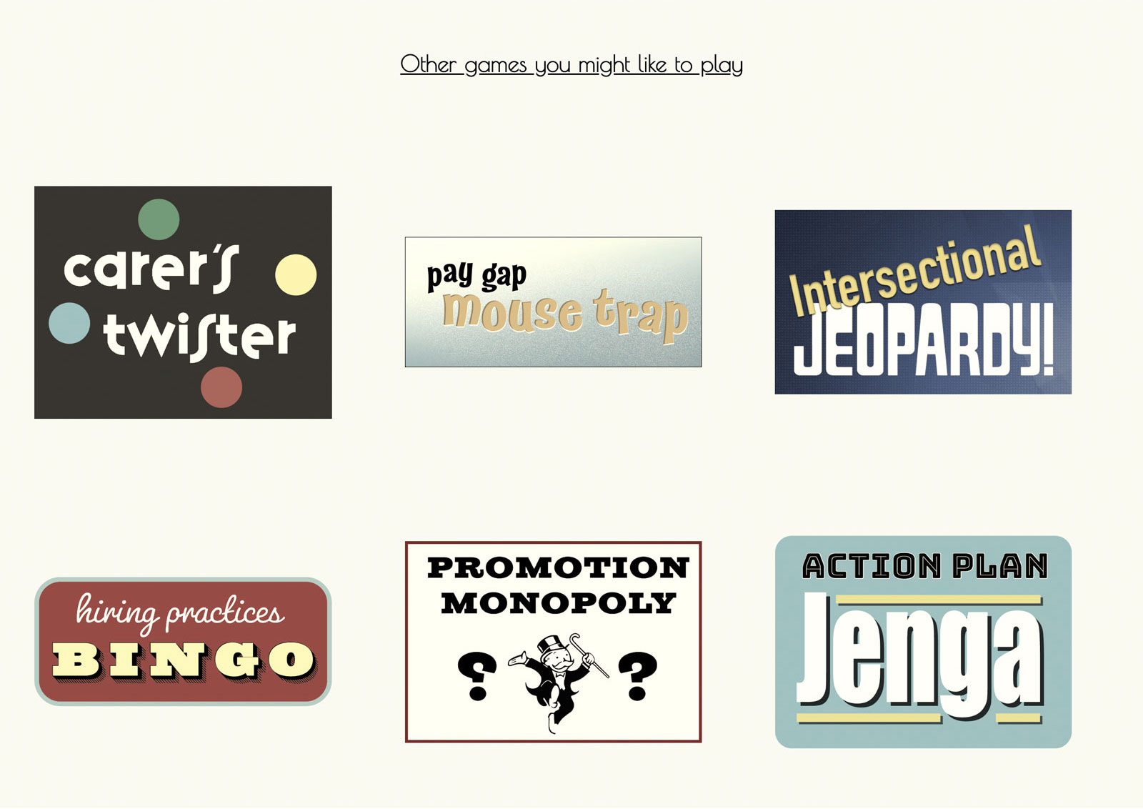
Reflecting on Athena SWAN Journey
In conclusion, our collaborative journey towards achieving an Athena SWAN Bronze status for the History department has resulted in an innovative and engaging infographic. Our project embraced creativity and collaboration, despite limitations in time and budget. Inspired by vintage board games, we added custom illustrations and interactive features to enhance user engagement. Throughout this process, we have learned the importance of adaptability, creativity, and teamwork in overcoming challenges and effectively communicating research findings. This infographic (best viewed on a Chrome browser) not only informs but also delights, reflecting our dedication to effective research communication. It stands as a testament to our collective efforts and the invaluable lessons learned along the way.
